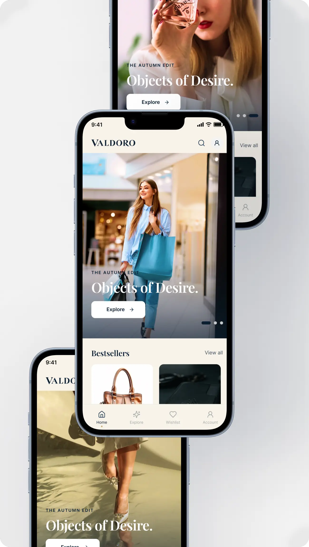
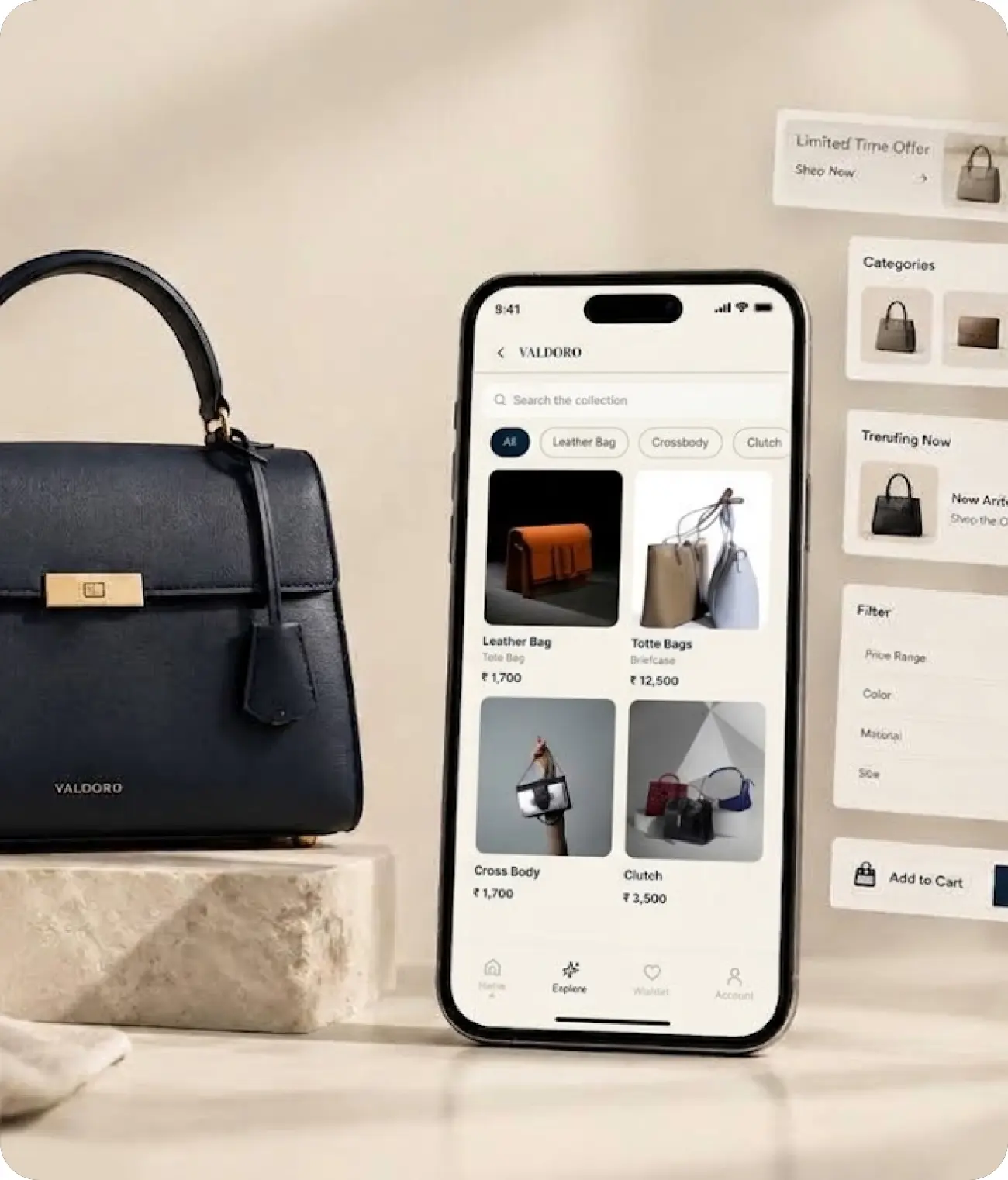
A quiet luxury ecommerce experience designed around clarity, craftsmanship, and confident purchasing.
VALDORO is a conceptual mobile ecommerce experience for a premium Italian leather-goods brand, created to explore how luxury brand expression can translate into a calm, intuitive digital shopping journey.
The experience brings together timeless craftsmanship, premium materials, editorial presentation, and effortless usability across the complete customer journey — from discovering a product to saving, purchasing, and managing an order.
Project Details:
Project: VALDORO Type: Conceptual Mobile Ecommerce Experience Industry: Luxury Fashion / Leather Goods Platform: Mobile App Base Frame: 390 × 844 px Role: Product Designer / UX/UI Designer Focus: UX Architecture, UI Design, Design System & Prototyping
Product Categories
Bags · Wallets · Belts · Shoes · Sun Glassess
Design Direction
The experience follows a quiet-luxury, editorial, and minimal design language inspired by premium fashion brands and Apple-like usability.
Rather than competing for attention with decorative UI, the interface gives priority to:
The result is a digital experience designed to feel refined without becoming complicated.
Goal & Problem Statement
My Goal
Design a premium mobile shopping experience that makes luxury ecommerce feel simple, confident, and effortless while maintaining the exclusivity and emotional quality expected from a luxury leather brand.
The goal was not simply to create a visually beautiful ecommerce interface.
It was to create an experience where brand expression and usability work together.
Problem Statement
Luxury products require consideration before purchase. Customers need to discover products, understand their quality, compare options, save items, and feel confident before committing to a purchase.
However, many ecommerce experiences can introduce unnecessary complexity through:
Visual clutter
Promotional distractions
Difficult product discovery
Overloaded product pages
Inconsistent navigation
Friction during checkout
Interfaces that feel more like marketplaces than luxury brands
What Problem Did I Solve?
How might I create a luxury ecommerce experience that feels visually exclusive while remaining clear, intuitive, and effortless to use?
VALDORO addresses this by creating a structured journey: Discover → Explore → Evaluate → Save → Purchase → Track
The design balances three key priorities: Desirability + Clarity + Trust
The result is a shopping experience where the interface supports the product rather than competing with it.
Research & Insights
Research Approach
VALDORO is a case study, so the research phase is based on secondary research and UX analysis rather than fabricated interviews or survey data.
I examined common patterns across luxury fashion ecommerce experiences, premium mobile commerce, product discovery, wishlist behavior, checkout flows, and mobile navigation to identify opportunities for a more focused experience.
Key Insights
01 — Luxury Needs Visual Restraint
Luxury does not need more decoration.
Premium perception can be strengthened through whitespace, typography, imagery, hierarchy, and consistency.
Design implication: Reduce visual noise and allow the products to become the primary visual focus.
02 — Product Discovery Should Feel Effortless
Users should be able to move naturally between categories, collections, search, and individual products without learning a complicated navigation system.
Design implication: Create a predictable discovery structure:
Home → Explore → Collection → Product
03 — Luxury Purchases Require Confidence
A premium purchase often involves consideration before commitment.
Users need enough information to understand what they are buying without being overwhelmed.
Design implication: Present information progressively:
Sofia is a digitally confident professional who appreciates timeless design, premium craftsmanship, and effortless shopping experiences. She prefers buying fewer, better-quality products and expects luxury brands to provide the same level of refinement online as they do in-store.
She researches products carefully before purchasing and wants to understand materials, craftsmanship, authenticity, delivery, and return policies before committing to a premium purchase.
Goals
Discover premium products without feeling overwhelmed
Quickly understand product quality and craftsmanship
Make confident purchase decisions online
Experience a refined, seamless luxury shopping journey
Save and revisit products she is considering
Track orders and manage purchases effortlessly
Frustrations
Cluttered ecommerce interfaces
Too many products competing for attention
Inconsistent product photography or information
Unclear material and craftsmanship details
Complicated checkout processes
Lack of trust around premium online purchases
Poor mobile shopping experiences
Behaviors
Researches before making high-value purchases
Compares products across collections
Uses wishlist to save products for later
Shops primarily through mobile devices
Values visual storytelling and product details
Expects fast, intuitive navigation
Is willing to pay more when quality and authenticity are clearly communicated
Needs
Clarity — Understand the product and its value quickly.
Trust — Feel confident about authenticity, quality, payment, and delivery.
Elegance — Experience an interface that reflects the premium nature of the brand.
Control — Easily save, compare, purchase, and track products.
Persona Quote
“Luxury should feel effortless — from discovering a product to receiving it.”
Pain Points → UX Opportunities
UX Architecture
Key User Journey Map
End-to-end experience of a customer on Valdoro App
APP Flow
Complete user flow of Valdoro - Luxury Leather Goods E-Commerce App
Design System
01 / Foundations
A tactile, restrained foundation.
The essentials of VALDORO are quiet surfaces, considered contrast, and an unmistakable editorial voice.
Brand Mark / Wordmark
VVALDORO
Color / Core Palette
Navy#0B1F33
Navy hover#162F49
Navy pressed#071725
Ivory#F7F3EA
Cream#F3EEE5
White#FFFFFF
Champagne#C9A96E
Gold dark#A27F46
Black#111111
Cool gray#C7C9C8
Surface / Radius
0 / Editorial
8 / Control
12 / Card
16 / Sheet
Elevation / Shadows
NoneSubtleElevated
02 / Typography
Editorial contrast, effortless utility.
Playfair Display gives the brand its distinctive presence. Inter keeps every action immediate and legible.
DISPLAY XL / PLAYFAIR DISPLAY 56/60The art of carry.
H1 / 36 / 40
A modern heirloom
H2 / 28 / 34
Made to be remembered.
BODY / 16 / 24
Designed in Milan, made by hand, and finished for a lifetime of use.
Display XL 56/60Display Large 44/48H1 36/40H2 28/34H3 22/28Body Large 18/27Body Medium 16/24Label Small 11/14
03 / Components
The everyday pieces, refined.
Buttons / All Variants
Product Card / Bestseller
♡VALDOROLa Contessa Italian calfskin · Tan ₹ 42,500
Input / Focus + States
Selection / Controls
Checkboxes ◉ ○
Toggle ● ○
Sizes S M L
Badges / Status
New arrivalExclusiveLimitedSold out
Icons / 20px System
⌕ ♧ ♡ ⌂ ⌁ ♙ ‹ × ✎ ⚱ ⓘ •••
Wireframe
1 / 7
Visual Design
1 / 8
Prototype
Explore the interactive VALDORO mobile ecommerce prototype.
Outcomes
What I Created?
VALDORO evolved from a UX architecture into a complete conceptual mobile ecommerce experience.
The final solution includes:
Structured UX architecture
Key user journey
Complete app flow
35 low-fidelity wireframe screens
Reusable design system
High-fidelity mobile UI
Interactive prototype
Complete discovery-to-purchase journey
Experience Outcomes
Clearer Discovery: Users can move from Home and Explore into collections and products through a predictable structure.
Stronger Product Focus: The interface gives product imagery, typography, and craftsmanship the visual priority expected from a luxury brand.
Simplified Shopping Journey: The flow connects discovery, evaluation, Wishlist, Cart, Checkout, Confirmation, and Orders without unnecessary complexity.
Consistent Interface: Reusable components, tokens, typography, spacing, navigation, and interaction states create consistency across the experience.
Scalable Foundation: The design system provides a foundation that can support additional products, collections, screens, and future ecommerce functionality.
Overall Outcome
VALDORO demonstrates how a luxury ecommerce product can combine:
The result is a calm, premium shopping experience designed to support customers from first discovery to confident purchase and post-purchase management.
Designing Quiet Luxury for Digital
VALDORO demonstrates that luxury and usability do not need to compete.
The project began with a simple question:
How can a digital shopping experience feel as considered as the product itself? The answer was not to add more visual elements, but to create a stronger foundation.
Every stage focused on reducing unnecessary friction while preserving the emotional qualities of a luxury brand.
The Core Principles
Desirability: Create an experience that feels premium and aspirational. Clarity: Make navigation, information, and actions immediately understandable. Trust: Give users the information and control needed to make confident decisions. Ease: Remove unnecessary steps from discovery through checkout.
Ultimately, VALDORO is a study in quiet luxury, thoughtful UX, and timeless digital craftsmanship — where the interface supports the product, rather than competing with it.
Thank You
Thank you for exploring VALDORO.
A study in quiet luxury, thoughtful UX, and timeless digital craftsmanship.